


share
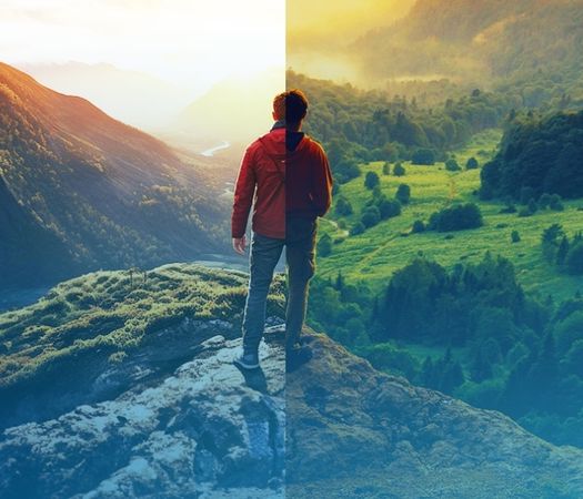
As an educator, your role is crucial in preparing students to analyze and evaluate media content critically. We’re here to support you with practical tips and an interactive quiz designed to enhance media literacy and encourage responsible AI use in your classroom. Let’s dive in and help your students sharpen their image evaluation skills!
STEP 1: Real or Fake Quiz
Step up to our image detection challenge! This quiz isn’t just about distinguishing between pictures; it delves into the fascinating world where AI, having learned from countless authentic images, creates deceptively realistic visuals. Here, your mission is to separate these images from reality. Each question spans a variety of subjects, challenging students to observe, analyze critically, and judge carefully. Are you ready to discern the real from the fake?
Each set contains one real image and one that was generated by AI.
Select the real image.
-
1. Category: Wildlife and Nature
Poisonous Frogs
AI-generated images are notorious for including intense colors, which can often be a giveaway that they aren’t real. But this is only sometimes the case. Poisonous frogs are known for vibrant, almost surreal colors and patterns, which may lead one to question even the real photos. Vivid subjects can make it difficult to determine whether something is real simply by looking at colors. In this case, the AI-generated image is actually more colorful, though that alone may not tell everything. Another area you can evaluate is the texture and pattern complexity. In the real version, the frog’s spots are much more detailed, whereas the AI version has spots that are much more simplistic.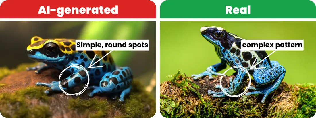
Daniel/Adobe Stock; Vaclav/Adobe Stock
-
2. Category: Historical Events
The Titanic
Historical photos have distinct qualities due to the photographic technology of their time. When reviewing these images, look for signs of aging, such as fading or sepia tones, and the style of photography prevalent during that era. AI-generated images may not accurately replicate these. This comparison is a more obvious one to distinguish, but the AI-generated Titanic still presents visual anomalies worth noting. For example, look at the difference in the ship itself. The Titanic had one mast and four chimneys, as pictured in the real photo, while the AI-generated image shows a ship with three masts and three chimneys. While you may not know this information off the top of your head, a simple comparison search online would reveal these details. The AI-generated image also contains inconsistencies in the light and shadow. You’ll see the front of the ship appears to block the sun’s rays, but these rays reappear in the middle of this ship even as the sun remains behind it.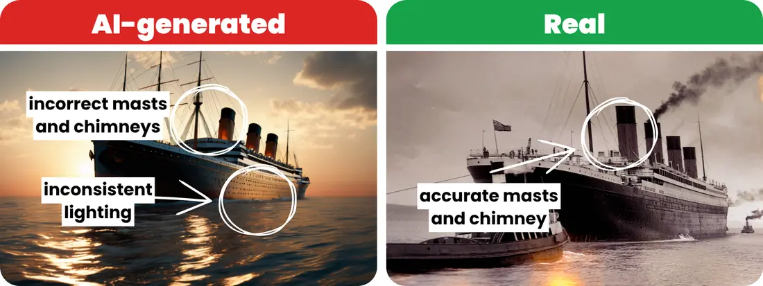
RobinsonIcious/Adobe Stock; nyiragongo/Adobe Stock
-
3. Category: People
Students Doing Art Projects
This image is a great example of AI missing the mark on its depictions of people. While the technology continues to advance and create more realistic-looking people, AI still struggles with details like arms and digits. While subtle, if you look closely at the children’s arms and hands, many appear misplaced or even missing. Some hands don’t match or align with the respective child, which is also a common error in AI-generated images of people.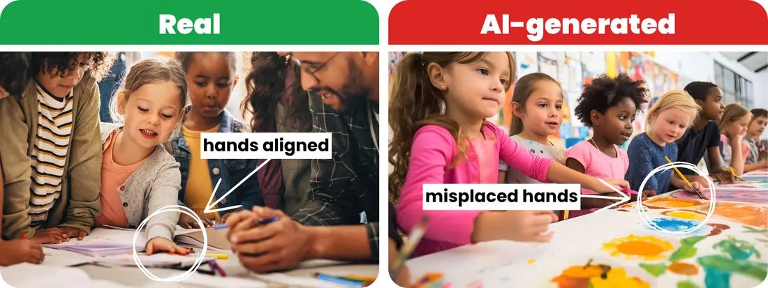
Jacob Lund/Adobe Stock; AspctStyle/Adobe Stock
-
4. Category: Significant Landmarks
Mount Fuji, Japan
This is a tough one. Both images of Mount Fuji, the highest mountain in Japan, depict beautiful, vibrant, and realistic-looking scenery. This AI photo is also well done, with seemingly accurate reflections in the water. AI often adds in details where they don’t exist to enhance the scene, such as the banks of trees, though this would be difficult to detect for most of us. But if you look closely, the landscape in the actual version has much more detail in the branches and leaves.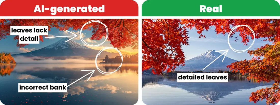
Rattanapon/Adobe Stock; Phutthiseth/Adobe Stock
-
5. Category: Space Exploration
Shuttle Launch
At first glance, these launch vehicle images share similar features and patterns, making them difficult to distinguish. The clouds, on the other hand, have rich texture, color, and lighting distinctions that could lead one to believe they’re both real. Yet, this is where our analytical skills come into play. We can uncover crucial clues by focusing on the nuances of lighting and texture. If you zoom in, it doesn’t take long to notice how simplistic the shuttle design is in the AI-generated image compared with the real image, which features more complexity in the lines, divots, and shading.
wasan/Adobe Stock; Ployker/Adobe Stock
-
6. Category: Geography
Hong Kong at Night
Cityscapes, especially at night, are among the more challenging image types to evaluate. You’ll notice both images have nice, detailed lighting and shadows, though in this example, the real image has much more. Another tip is to look at the background (the mountains) and the foreground (the buildings). You’ll notice inconsistencies, though if you do not immediately know how Hong Kong is laid out, you may not know which is real. The same goes for the building shapes and sizes in the foreground, which are slightly different in each photo. With a little effort, a simple online search of Hong Kong would reveal the truth: The mountain heights are more varied, and the building heights are not accurate in the AI-generated image.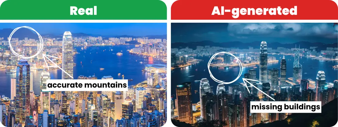
pigprox/Adobe Stock; Iftikhar alam/Adobe Stock
-
7. Category: Natural Phenomena
Aurora Borealis (The Northern Lights)
In the realm of natural wonders, discerning the real from the artificial here is as challenging as it gets. These displays, with their vibrant, almost unbelievable colors, can blur the lines between reality and fantasy. For students who’ve never personally witnessed such phenomena, discerning the true Northern Lights is no easy feat. Focus your evaluation on the reflections in the water. In the actual photo, the reflection matches the lights precisely, including their distinct shapes and directions, whereas the reflection in the AI-generated image appears to have inconsistent pink and green coloring added in.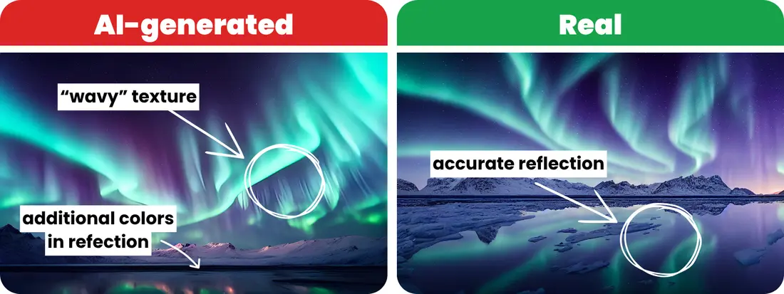
ECrafts/Adobe Stock; Lily/Adobe Stock
-
8. Category: Endangered Species
Pangolin
The challenge of discerning reality from AI-generated images becomes even more pronounced for students when it involves rare and unfamiliar animals like pangolins, also called scaly anteaters. Their limited exposure to such unique creatures means they often lack a frame of reference for what these animals typically look like, making it harder to spot inaccuracies in artificial representations. As you look through these images together, you’ll notice the detail is well done in both versions, from scale details to little hairs on the faces. If you investigate a bit deeper and consider our Facial Features tip, you’ll start to see that AI doesn’t quite capture the pangolin’s eyes and expression in realistic ways. Additionally, check if proportions, like the size of the face and limbs, appear realistic. This approach not only sharpens their observational skills but also enhances their understanding of animal biology.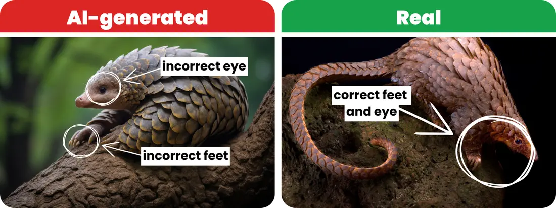
Veniamin Kraskov/Adobe Stock; mgkuijpers/Adobe Stock
-
9. Category: World History
Ancient Egyptian Papyrus
History can be another topic that requires additional inquiry. In these ancient Egyptian papyrus scroll images, both appear to be worn and dated in some way, which would make sense considering these scrolls would be thousands of years old. While the AI-generated image incorporates an aged artifact appearance, you can see, once again, that AI struggled to get the people right. Zoom in to see the hands are missing and arms end out of nowhere. Despite the artifact’s wear and tear over time, the hands and digits would still likely exist, even if faded. Also, a quick analysis of the hieroglyphs shows they are not actual Egyptian symbols.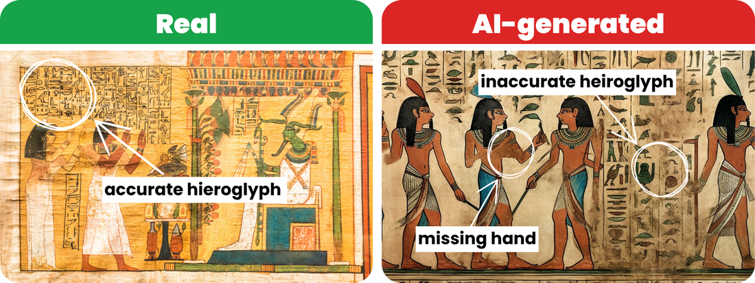
Paolo Gallo/Adobe Stock; Paulina/Adobe Stock
-
10. Category: Influential Events and Figures
Women’s Suffrage Movement
When analyzing images of influential events and figures, especially historical ones, scrutinize the details closely—especially people and facial expressions. Authentic photographs capture natural asymmetry and nuanced features; AI images often look overly symmetrical or subtly distorted. Also consider historical context: clothing, signage, background settings, and the photographic style should align with the period. In this case, the AI-generated version gives itself away in the faces and signs: faces appear slightly blurred, hair lacks fine detail, and sign letters look jumbled or nonsensical compared with the real photograph.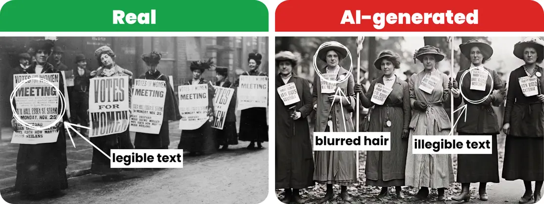
George Grantham Bain Collection/Library of Congress; Szalai/Adobe Stock
How did you stack up?
STEP 2: Look at Images through a Critical Lens
10 Key Questions for Evaluating Images
Practical Tools for Image Vetting
STEP 3: Tips for Spotting AI-Generated Images
STEP 4: Continue Practicing & Learning
NEW!

Recent Blog Posts

Using Britannica School and the World Cup to Score Big in the Classroom
Read More: Using Britannica School and the World Cup to Score Big in the Classroom
Teach Britannica, for Educators, with Love
Read More: Teach Britannica, for Educators, with Love

Summer Reading Ideas for Kids: Free Activities & Book List
Read More: Summer Reading Ideas for Kids: Free Activities & Book List
Practical Jokes or Practical Adaptations: Can You Find These Critters?
Read More: Practical Jokes or Practical Adaptations: Can You Find These Critters?

How Deep Are Your Roots? An Earth Day Curiosity Quiz
Read More: How Deep Are Your Roots? An Earth Day Curiosity Quiz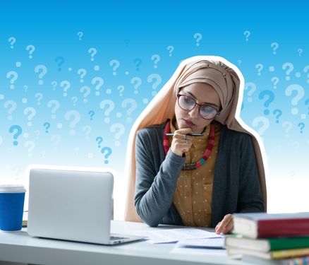
If We Can’t Trust What We Read, What Does That Mean for AI in Schools?
Read More: If We Can’t Trust What We Read, What Does That Mean for AI in Schools?
Teaching Women of the American Revolution During Testing Season
Read More: Teaching Women of the American Revolution During Testing Season
Join Our Newsletter
From tips and tricks to engaging activities, find
attention-grabbing content for tomorrow’s lesson.